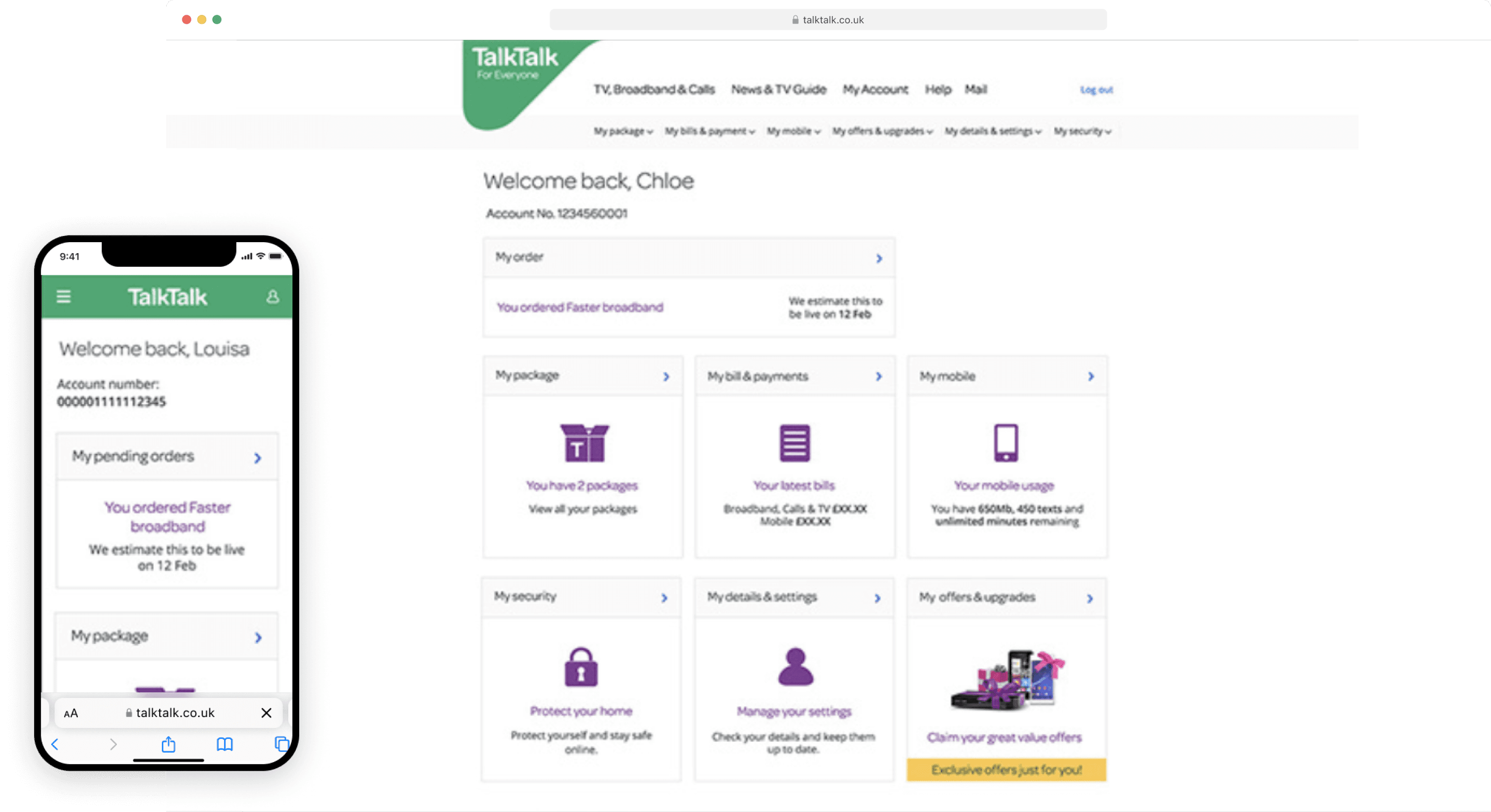
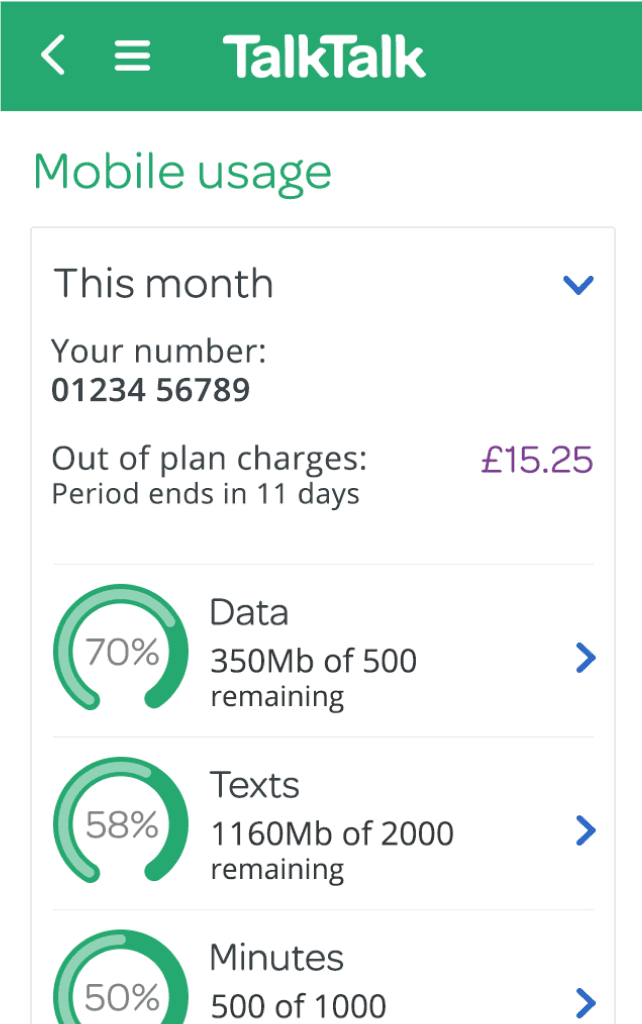
Project: Redesigning the "My Account" logged in experience for TalkTalk, one of the top5 british telecoms
Year: 2015 - 2016
Role: Senior UI Designer
Help TalkTalk develop a vision and first iteration for a new “My Account” that enables users to login and self-serve, reducing the use of call centres.
As the primary UI designer on this this project I had to work very closely with the several departments involved (Product, UX, Engineering) to deliver the first iteration of this new experience, as well as being responsible for liaising with the wider design department and leadership.
Scope definition
Initial research focused on learning what was not working about the existing experience. We interviewed users and ran usability tests whilst also partnering with the data team to analyse click-through rates to certain features, help pages and FAQs.
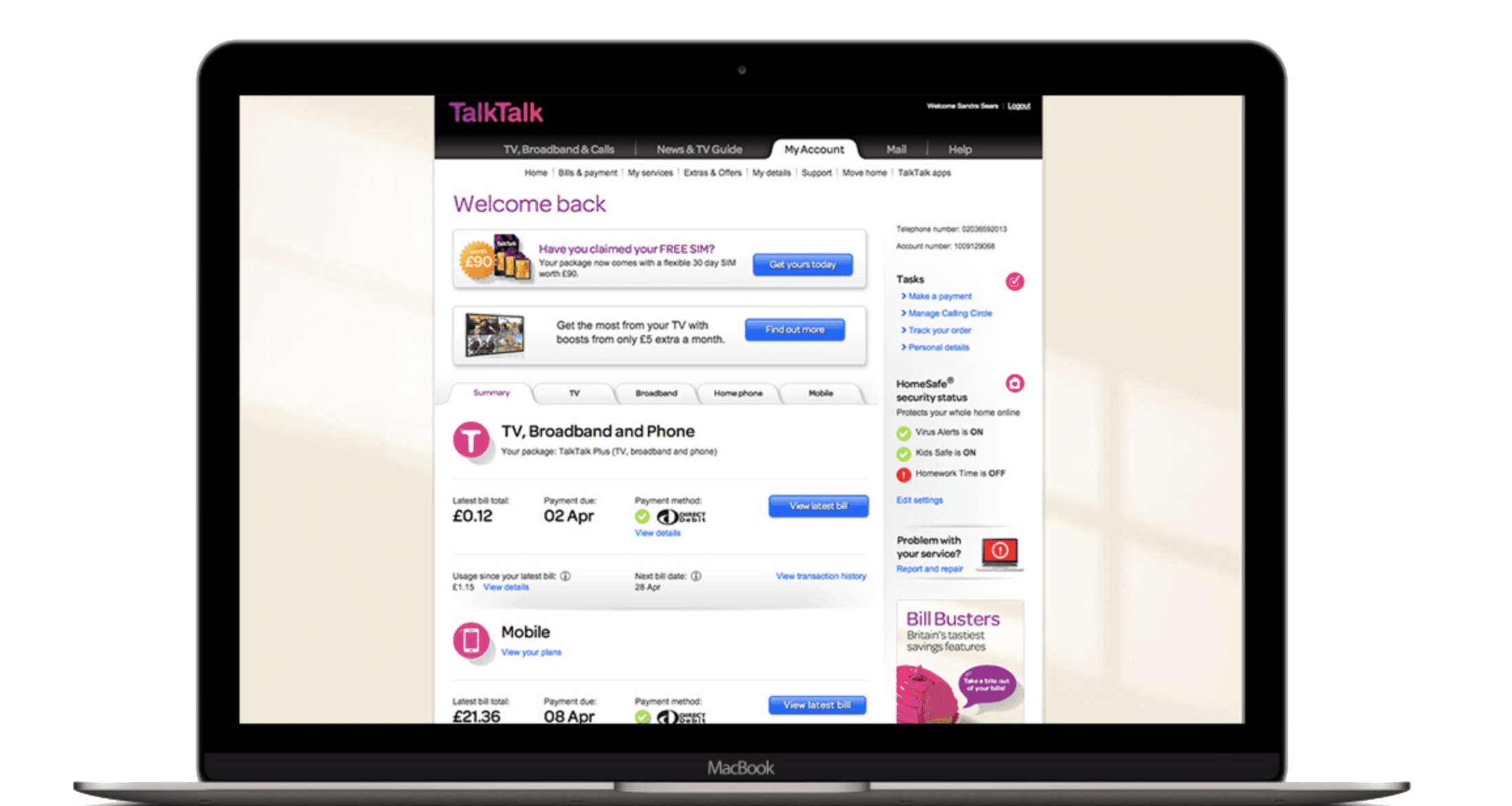
"Gen6" TalkTalk MyAccount back in 2015
Challenge:
Our approach:
We decided to define a set of 4 principles and goals that encapsulated our main findings (listed below) and to create personas to help guide decisions.
In the meantime, we were supporting our lead designer in translating the new brand assets into our digital environment and support the new brand implementation.
A dedicated squad was created to implement the new design system, so we worked closely with them throughout to create the components we'd be using for this piece, so we'd contribute to this design system effectively and help it scale sustainebly.

Principles & goals that encapsulated the learnings and guided us through decisions
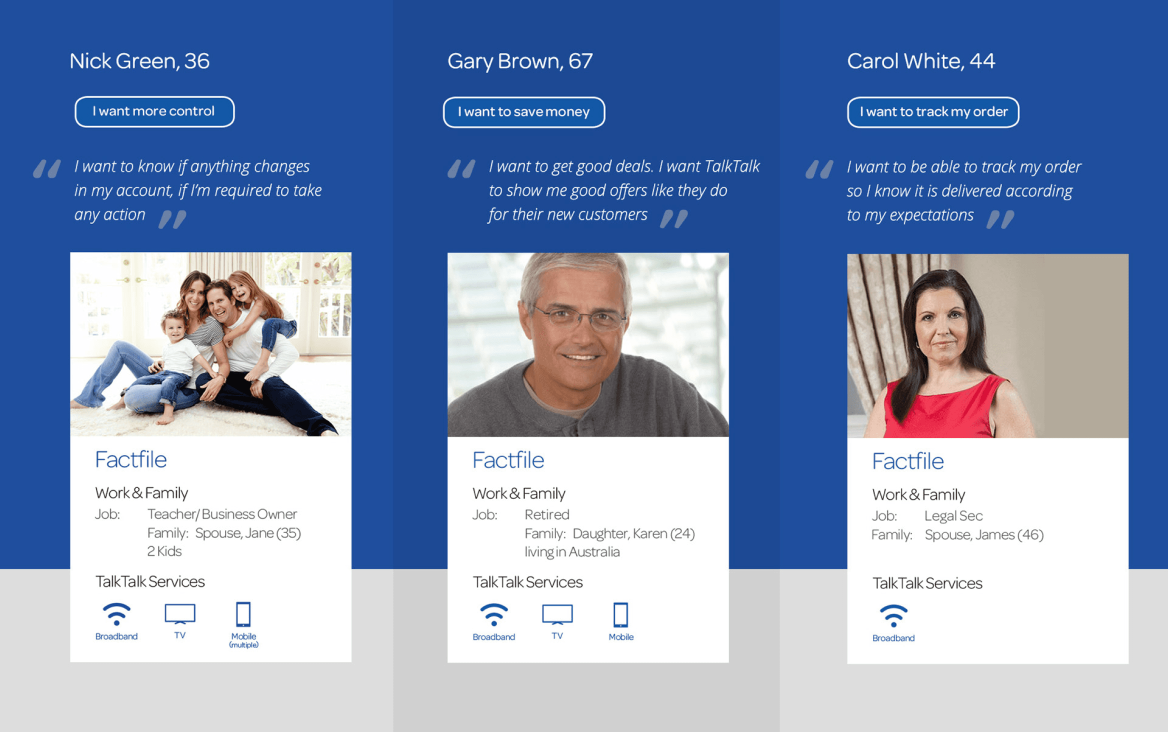
New personas
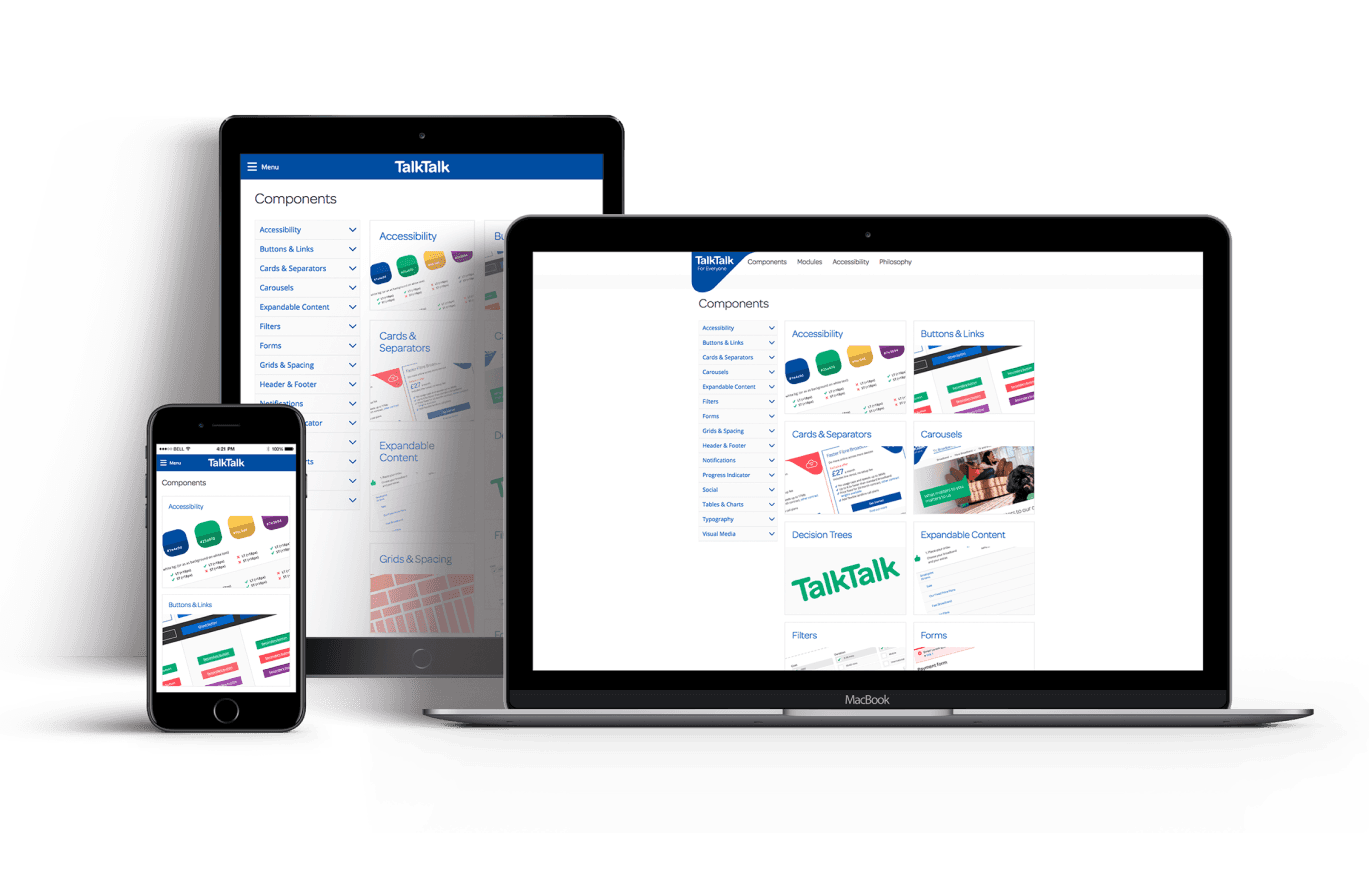
The new design system
Design vision & strategy
Myself and the design lead quickly collaborated on putting together a product vision prototype that we could pitch to senior leadership. Using it as a tool to advocate for the value of solving the UX issues we'd identified and get buy in from different parts of the business.
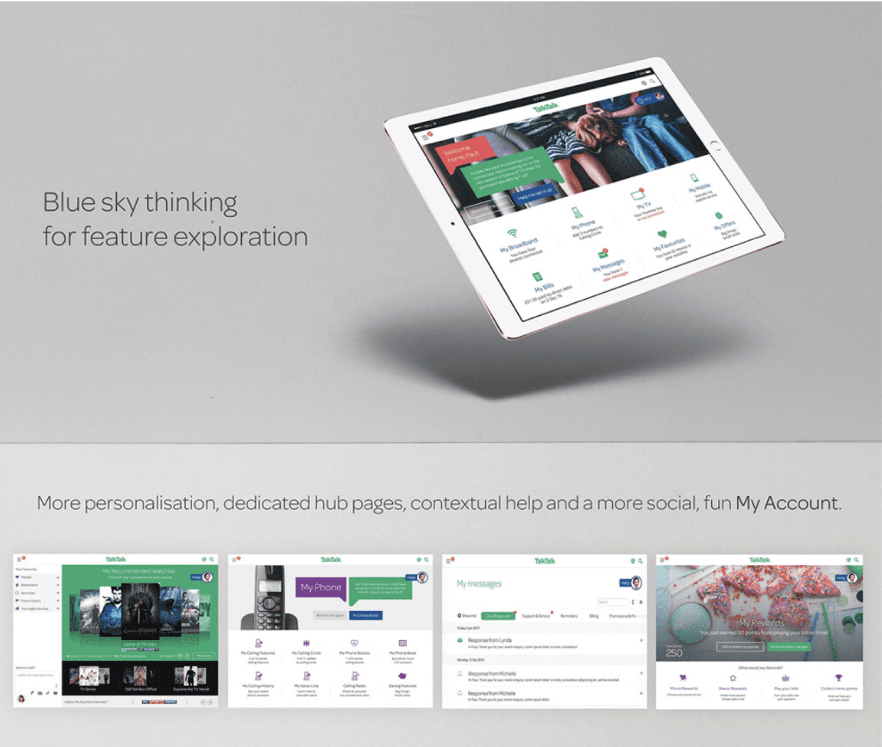
Within this vision piece, we explored all the concepts we established as the key ones to address our users's main issues:
An overall more intuitive information architecture
A freshly re-designed dashboard with dedicated hubs featuring our new brand.
Transparent, helpful and jargon-free copywriting, pre-empting issues and FAQs with contextual information
A personalised experience: offering solutions before they had to report problems, suggesting products or content they may want based on their usage, etc.
Rewarding loyalty: new rewards hub designed to thank them for staying with us

Concept piece, pitch presentation slide
Solutionising
With all the ground work done and have buy in from users and leadership, it was time to look at specific UX problems and design the MVP of this new My Account, whilst working with the design system squad to implement new components appropriately.
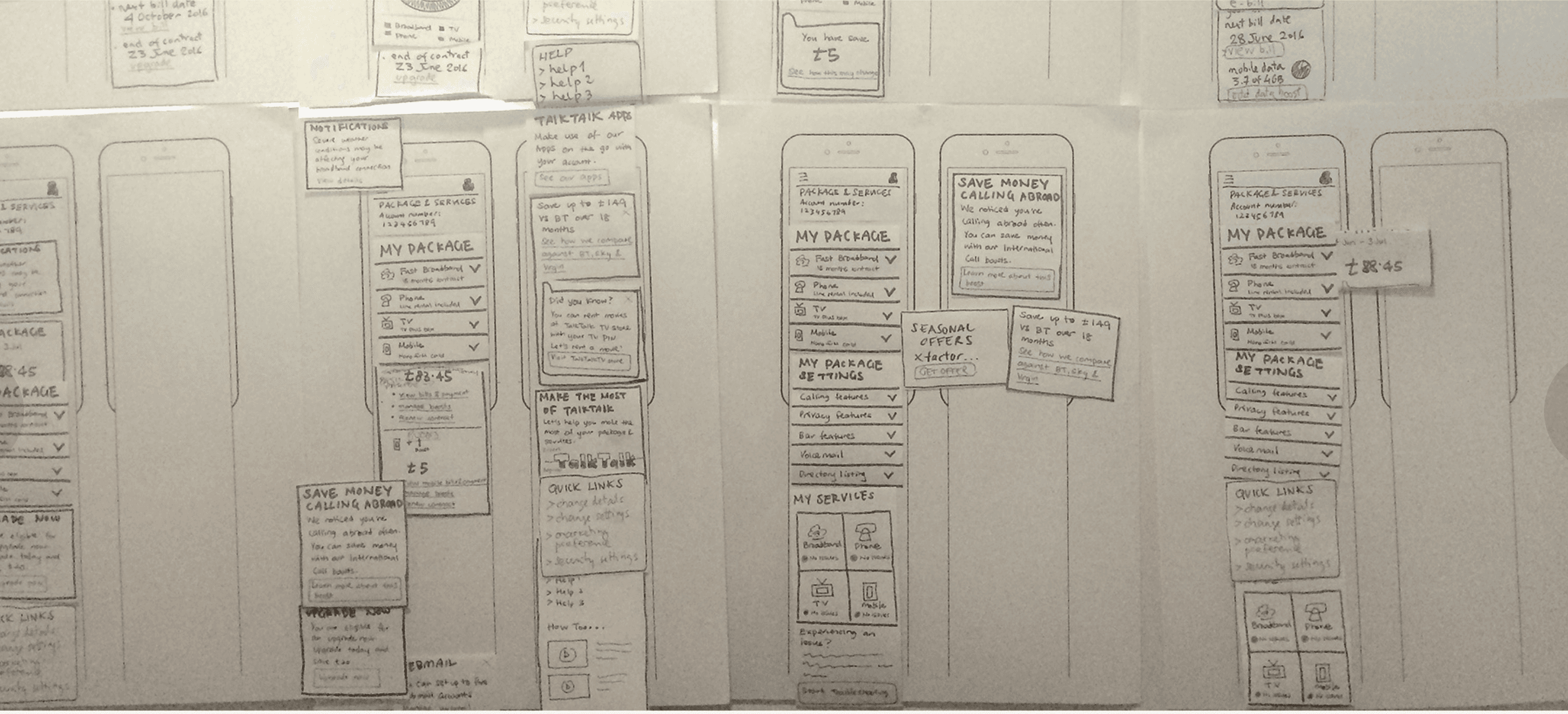
Paper prototypes we used as a team to think through the journeys
Challenge:
We identified many complex solutions to the UX issues, after spending a lot of time exploring these.
However senior leadership now wanted results (and rightly so) and so we committed to delivering an MVP design within a tight deadline. We needed to make snappy but good decisions.
My bet:
I suggested we try the design sprint methodology to fail fast and learn fast.
We got the scrum team together and in a week we ideated, prototyped and tested 3 different candidates for a new dashboard.

Sharing progress with the wider design team
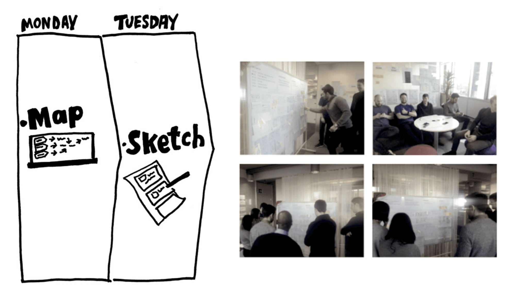
Crazy 8s + detailed sketching and voting session with the full scrum team
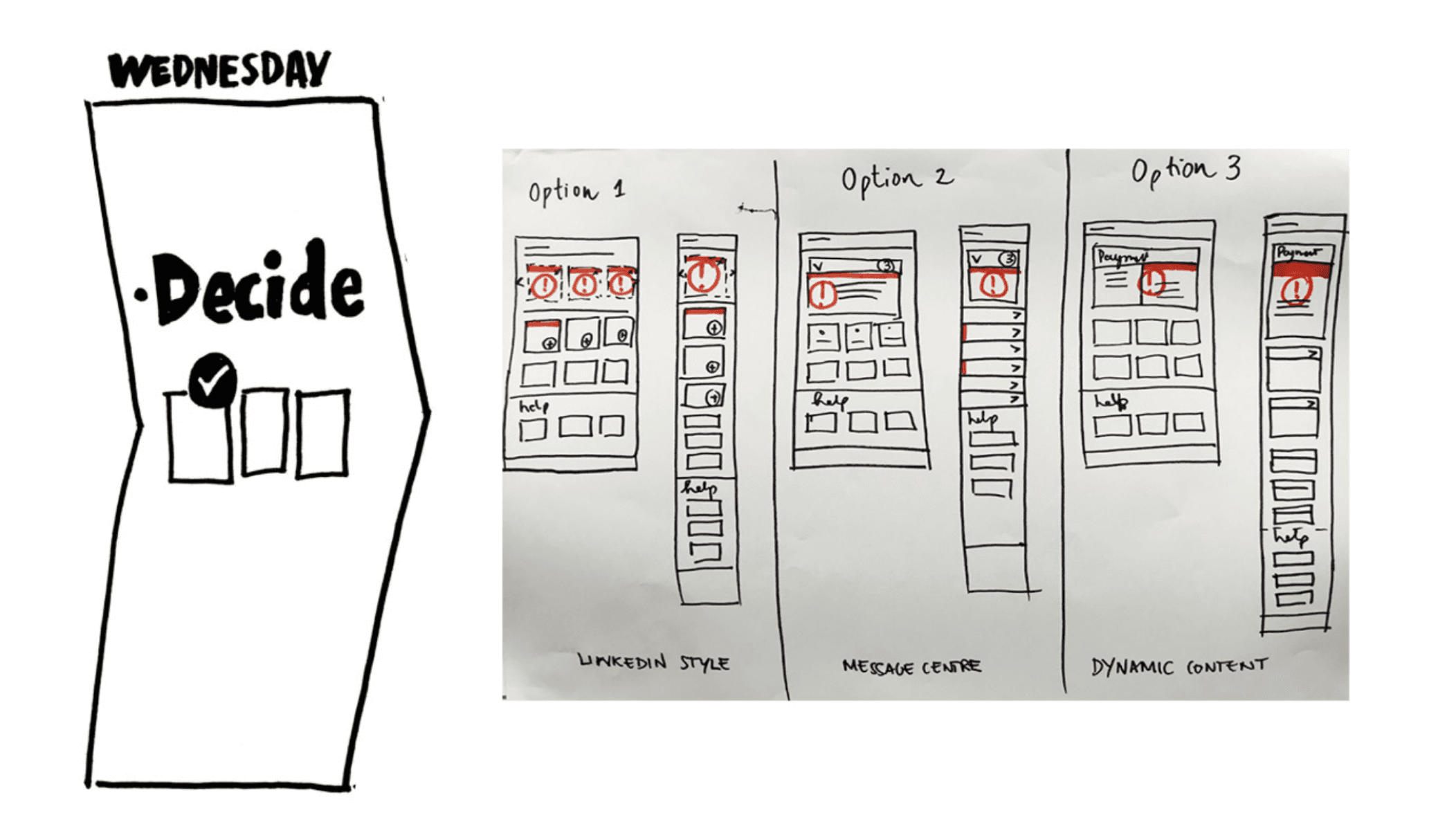
Deciding to do an A / B / C test with the 3 strongest ideas, with a focus on how to serve notifications / messaging
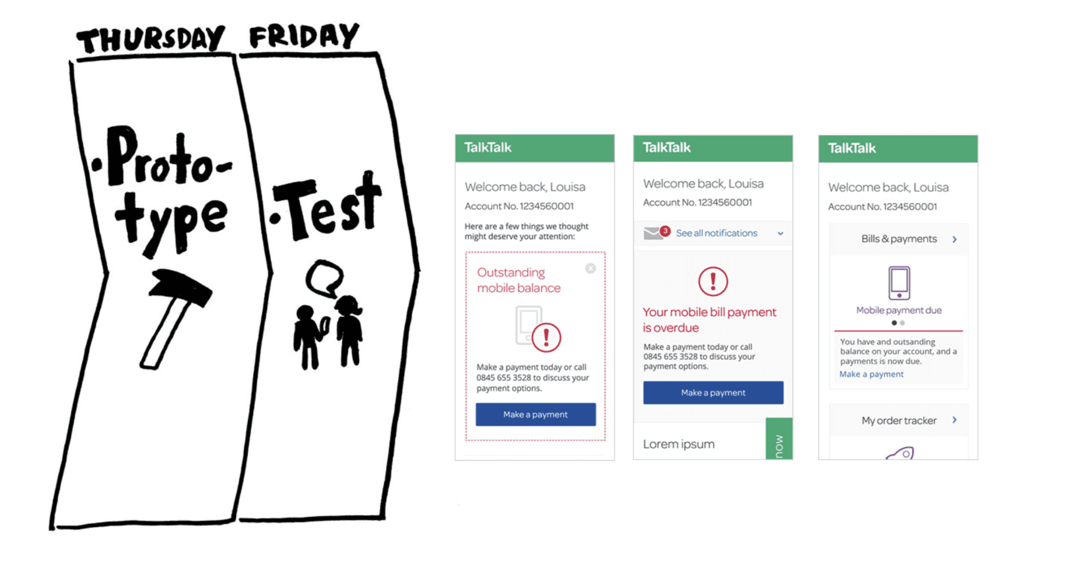
Prototypes that were used in the test rounds
MVP Design
With the learnings from the design sprint we were able to deliver the MVP within the desired timeline and come together with other squads at TalkTalk to deliver a fully rebranded MyAccount experience which resolved all the main UX issues we identified.
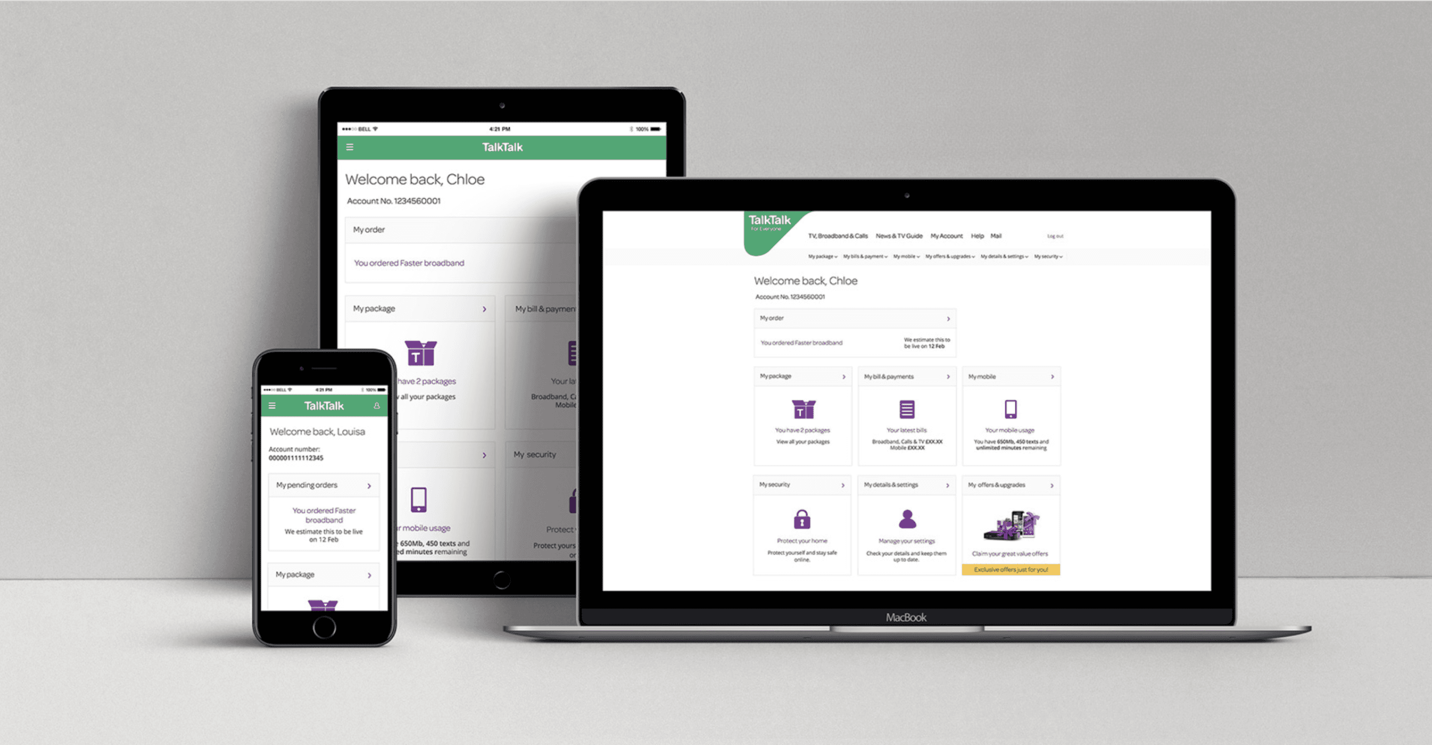
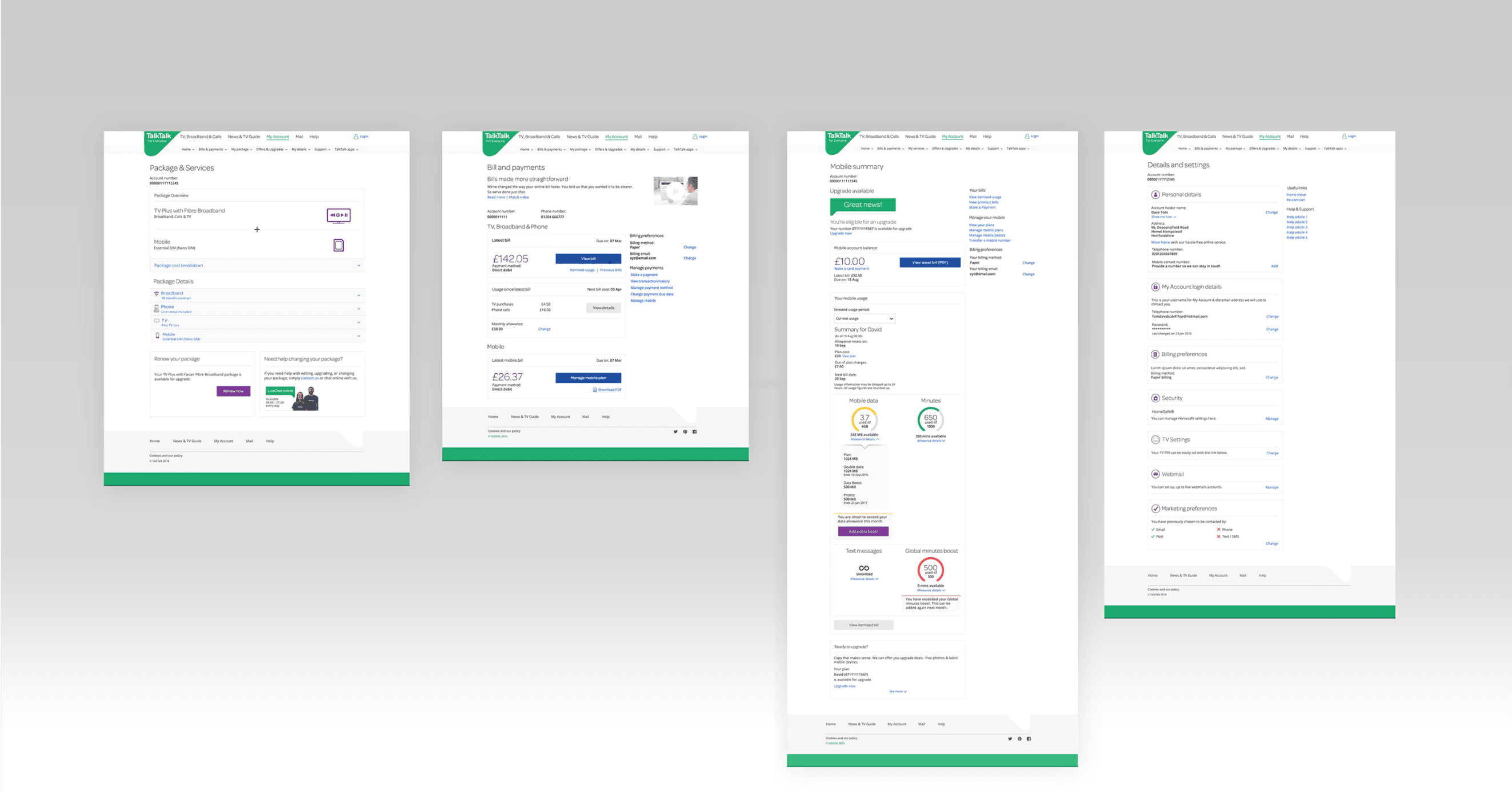

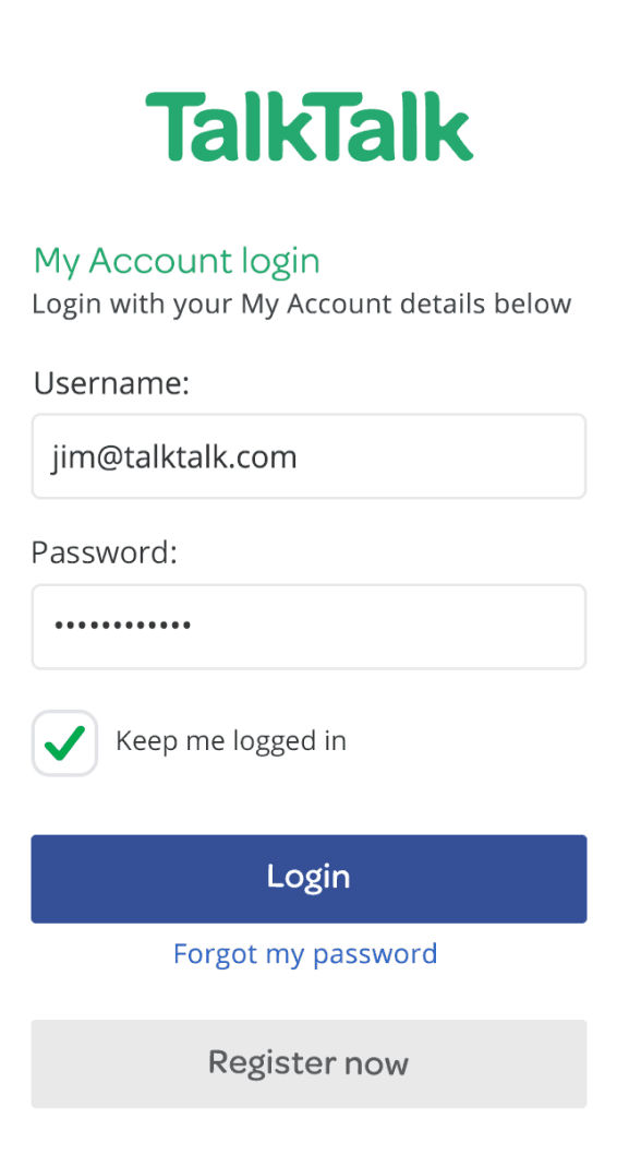
A “Gen7” TalkTalk
Reflecting on the work:
We've come a long way since our old, "Gen6" TalkTalk to the new “Gen7” world.
I left the company after the first MVP release and so I can’t really report on metrics. However, it was very evident from all the usability testing that we have done both while the work was being developed but also after it was concluded, that we had achieved something massive. We were hearing our customers use the very same adjectives that we set out as our goals to describe the new My Account experience.
With all these parallel efforts of the My Account re-design, the overall re-brand and creating our first design system, TalkTalk’s product was unrecognisable for all the right reasons. Internally the team was transformed as well: we were more agile, more organised and more focused than ever.
