
Project: Brand design for GoCarer, a UK autism healthcare provider
Year: 2017
Role: Graphic Designer
I was commissioned to design a logo and brand guidelines for Go Carer - a team of autism experts, therapists and carers dedicated to creating the best possible outcomes for individuals and their families.
For a month we worked collaboratively to create a brand worthy of this incredible mission. The team at GoCarer were an amazing client and I'm immensely proud to have taken part in a bit of their journey.
Brand discovery
GoCarer was a brand new business, meaning there were no existing weaknesses or strengths to explore. We had to start from the very beginning and I had a lot to learn.
Challenge:
I needed to understand the business model, motivations of the founders and ambitions for GoCarer in a short period of time. These were all critical being able to develop a brand that aligned with the business objectives and had longevity.
My approach:
I gave the team at GoCarer a form with questions that I normally hand clients at the beginning of any branding work. Had them describe their business, their USPs and collected some existing ideas they had on logos they liked and thought would appeal to their audience.
Defining brand values

Condensing the teams thoughts into 3 groups of values

Compiling visual references for the values we outlined
Competitor analysis & moodboarding
Care industry competitors

“Anywhere, anytime” industry: fun, relaxed

“Anywhere, anytime” industry: sober, functional

Logos that encapsulate the feeling of care

Logos that encapsulate a special, unimaginable world

Visualizing the idea of spectrum
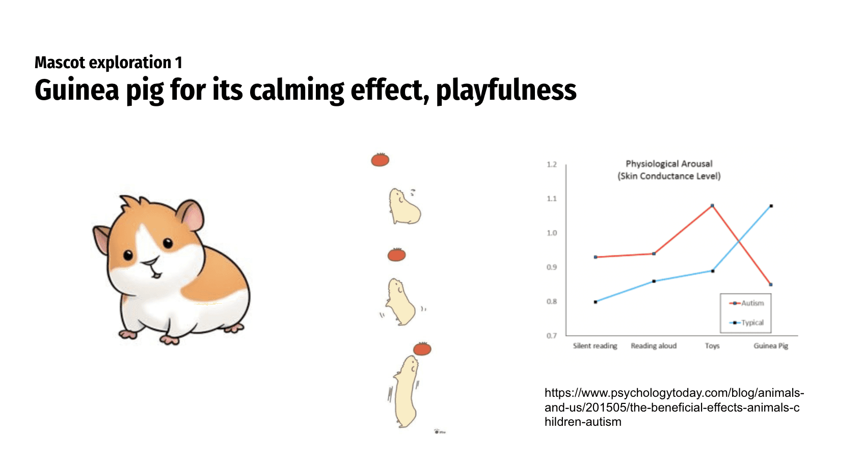
Guinea pig as a mascot inspiration
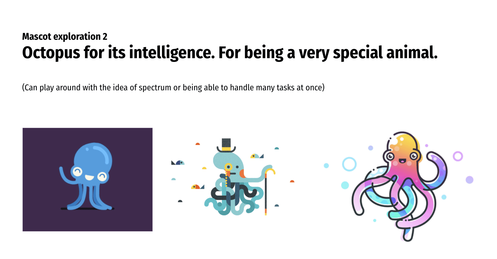
Octopus as a mascot inspiration
Visual exploration
Having agreed on brief and visual inspirations for both logo and mascot, it was time for me to start sketching and envisioning their brand.
Challenge:
I managed to get the GoCarer team excited in the moodboarding phase which was great news but we were still left with many different potential directions that I knew there was a risk we wouldn't be quite aligned in what ideas might be the strongest.
My approach:
Many designers are reluctant to show sketches that don't look good or look unprofessional, I personally will take anything that helps me explain an idea. I wanted to get to alignment fast and spare us all frustrating back and forth. I grabbed a notebook and a few A4 pages where I sketched all the ideas I could think of and presented them to the team.
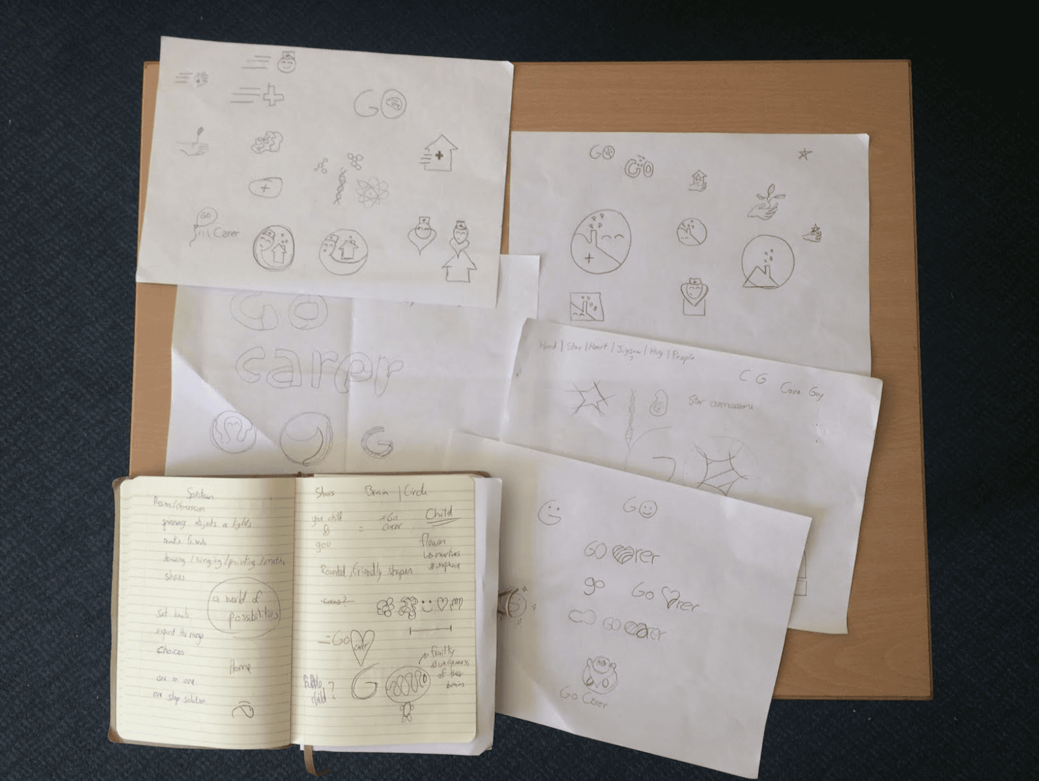
My initial sketching brainstorm

Few of the drawings in the notebook
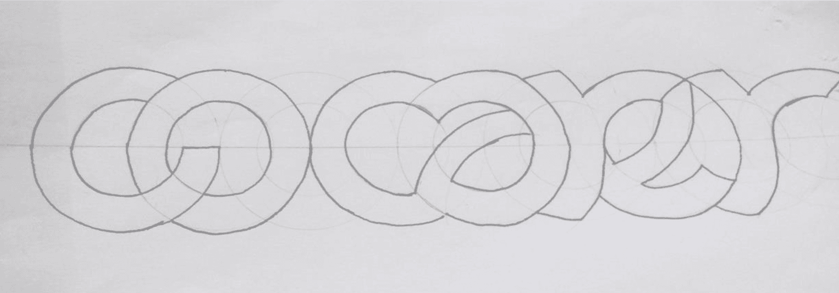
Starting to think about typography
Font selection
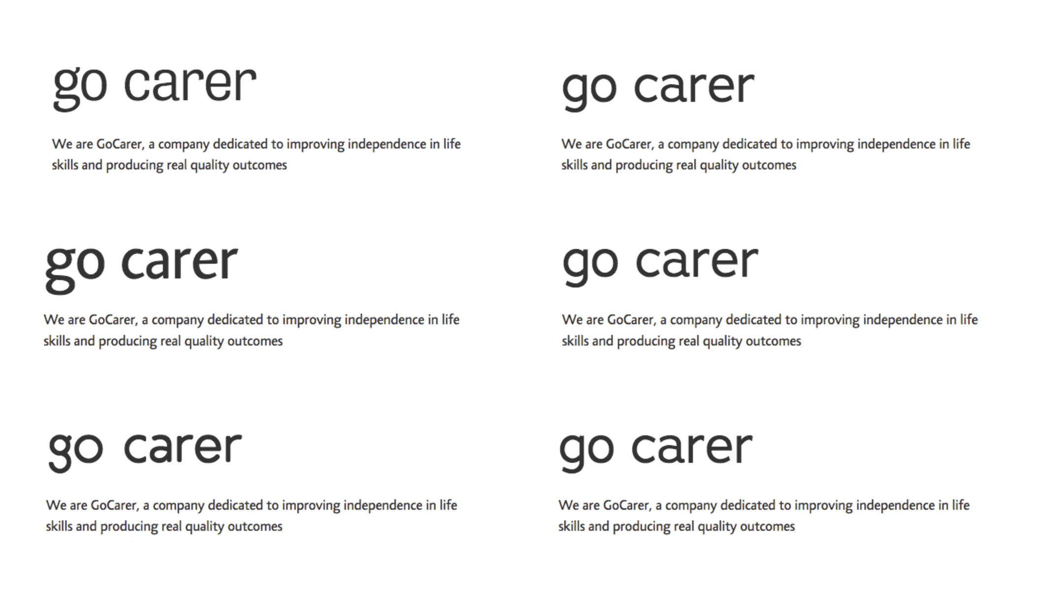
Exploring fonts: humanistic vs geometric

Montserrat alternates
Creating an emblem, inspired by the red cross
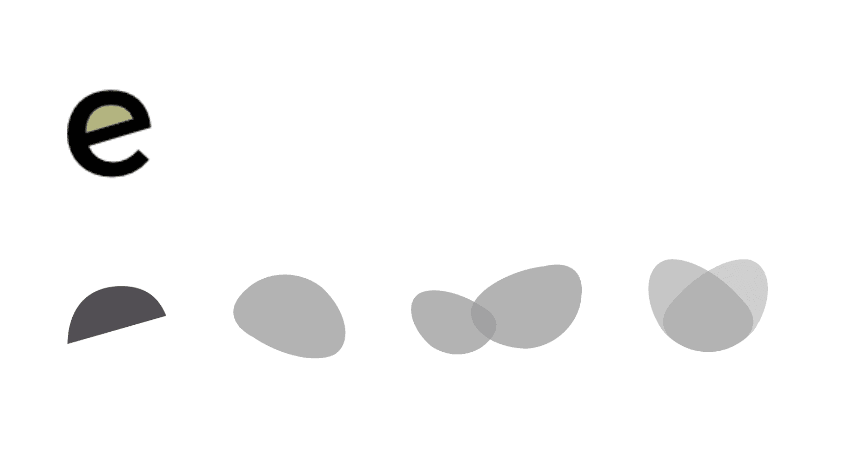
Creating an emblem from the "e" letter

Exploring combinations

Placing shapes in a circle in search for an emblem
Building a mascot from the emblem

A butterfly shaped mascot

An octopus shaped mascot

An abstract character built on this same feeling of nurture and care
Adding colour

Color palettes from moodboard and brand key words

Applying color to the shapes

Butterfly concept in color, playing around with composition

Octopus concept in color, playing around with composition

Abstract mascot concept in color, playing around with composition

Throwing in a more sober, less child-like option in the mix

Expanding on composition, with use of typography and extra shapes
Logo lock-ups

Typography capitalization options

Logo lock-up exploration

Applying different color schemes to the logo lock-up
Go Carer's selection

GoCarer's logo and mascot choice
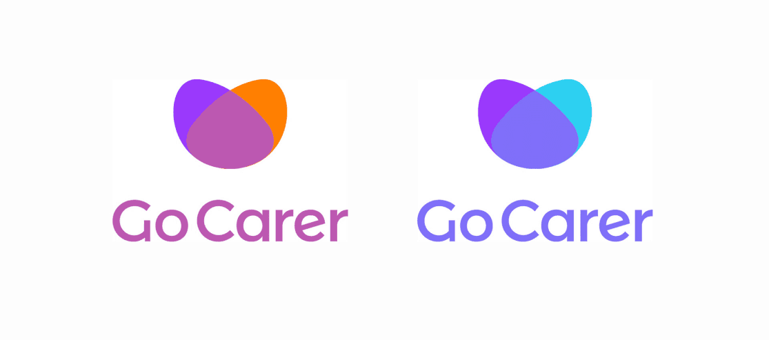
Color choice: B2C (left) and B2B (right)

Mascot in color: B2C (left) and B2B (right)

Logo and brand identity guidelines doc
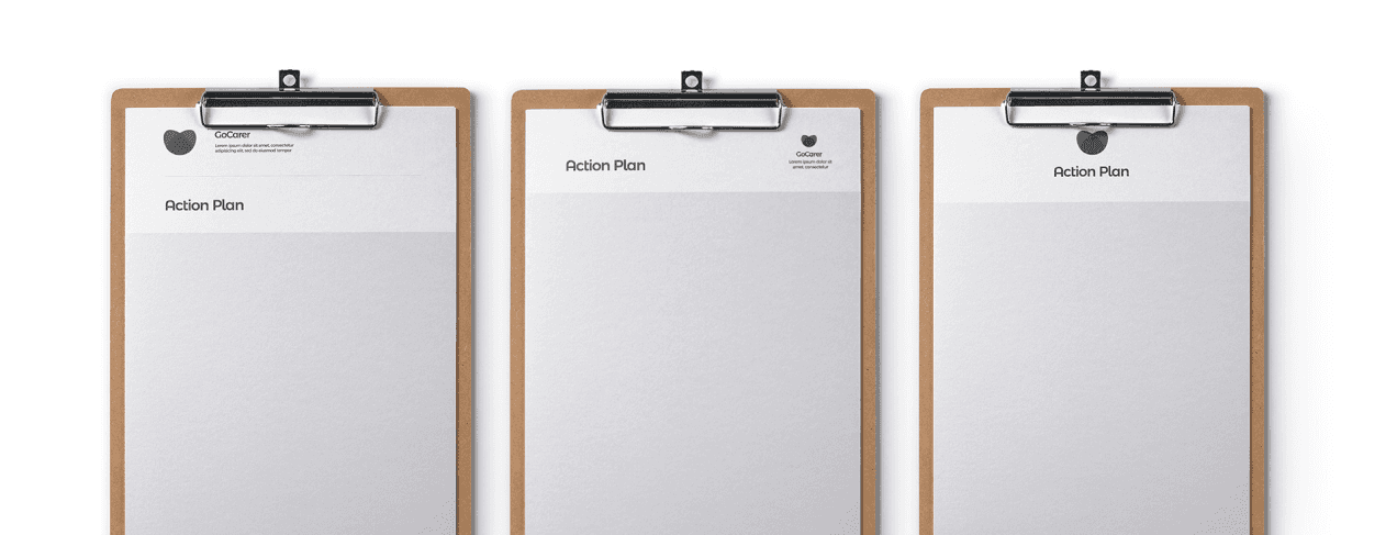
Logo placement mock-up: document header

Logo placement mock-up: business cards

Logo placement mock-up: marketing pamphlet

Logo placement mock-up: carer scrubs

Logo placement mock-up: Billboard
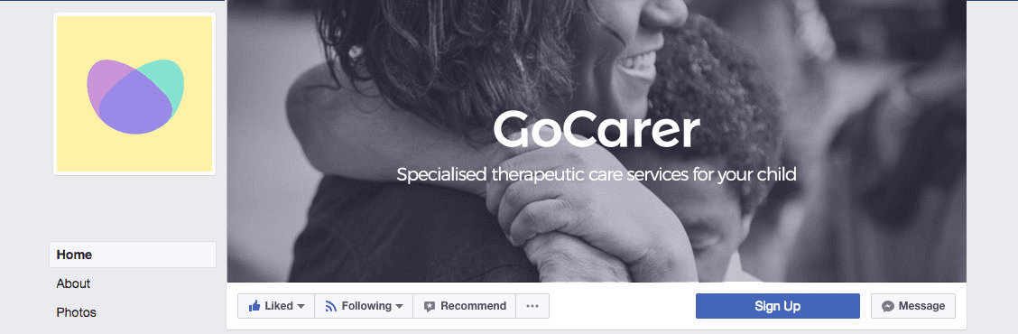
Logo placement mock-up: Facebook profile

Logo placement mock-up: website
