Project: Music artwork for my band, Novos Londrinos

Year: 2022

Role: Brand & Graphic Designer

Designing the artwork for my band's first single and merch

I'm the vocalist to the brazilian-inspired band Novos Londrinos and in May 2022 we went to the studio to record our first single featuring the 2 first songs we wrote: Prova de Charme and Lua Rosa. We were crowdfunded but had limited funds to make it all happen and every step of the process was quite costly, so I decided to take on the challenge to design an artwork that we'd all be proud of.

Single theme exploration

As a band we had been together for not even a year so were still relatively new. We still didn't have a consolidated brand or any tangible visuals we associated with ourselves. Aside from that, in music each piece of work you put out its a concept of its own and needs its own identity.

Challenge:

There's 3 of us co-founders and co-managers in the band, so even though I had a good sense of where I wanted this brand to go, I needed to get buy in and approval from my peers.

My approach:

The first obvious step was to bring my ideas and concepts to life by putting together a moodboard that would help visualise and present them to the rest of the band.

Imagistic moodboard

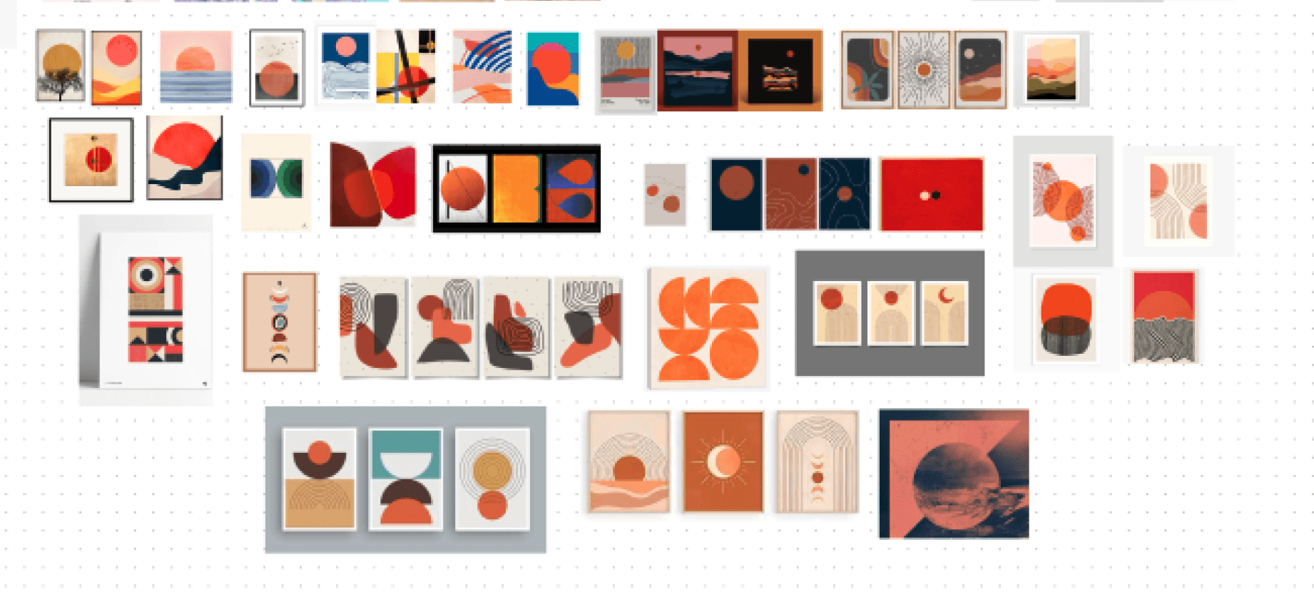
One of the tracks in the single was "Lua Rosa" which means Pink Moon, so I thought the whole tune had a super strong imagistic already. I saw a circle emerged in some cool graphics to represent a misty sky in some shade of the color pink. I browsed around collecting images that would help paint that universe in my head.

GoCarer came up with the interesting slogan of "care where-ever and whenever" that really spoke to their ability to home visit as well as offer 24/7 online support, which was what differentiated them from other more traditional care operations. They also wanted their brand to be less about society and more about the individual, as they were occupying a different space than their competitors. The goal was to speak to autistic kids and their parents, who want them to be the best they can be.

Different visuals and shapes that helped me explain my vision to the band

Album cover references

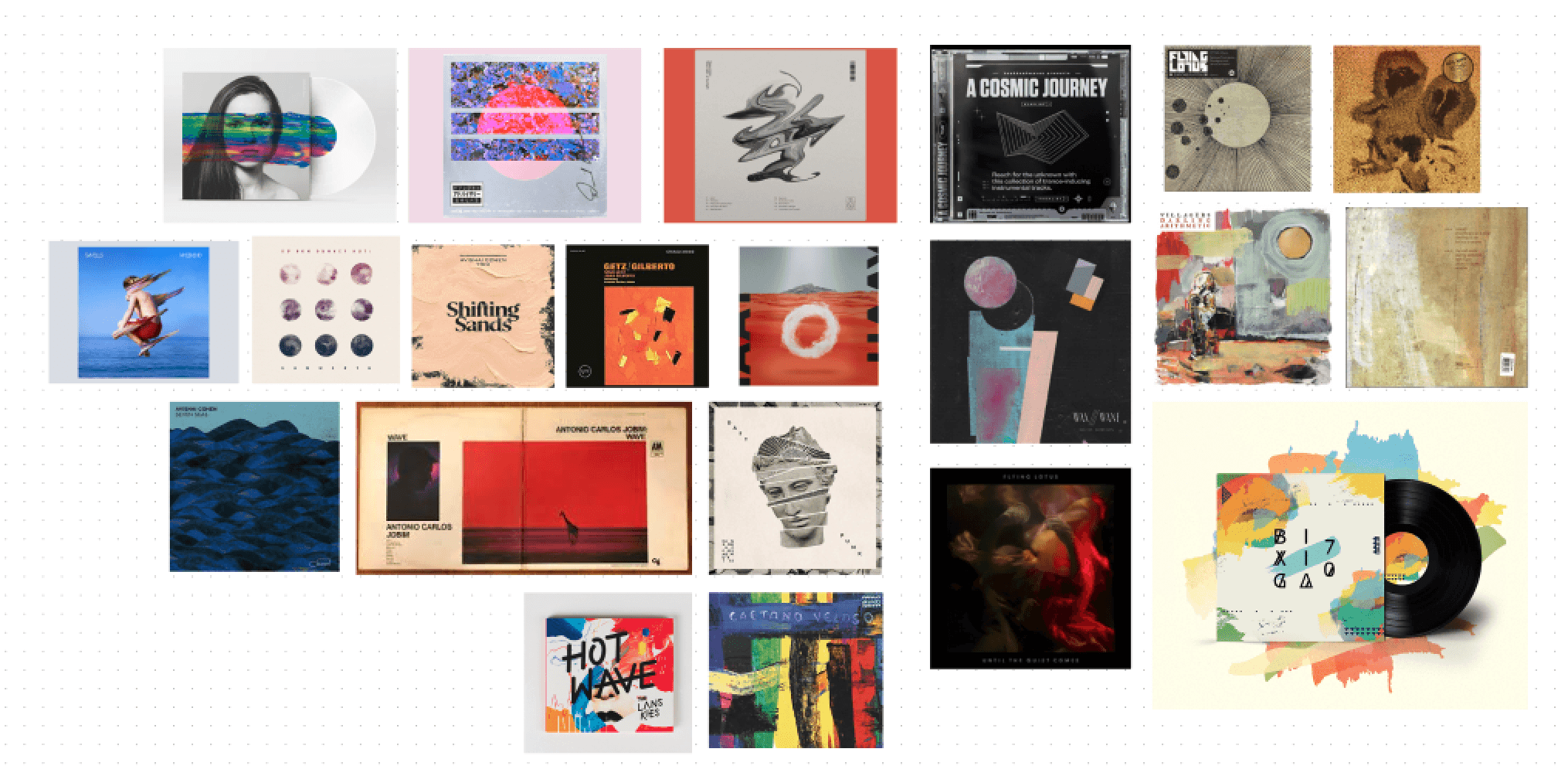
As well as chasing the "Lua Rosa" imagistic, there were some more formal considerations to bear in mind. I had never designed an album cover before and wanted to collect references that would help me achieve the mood I was hoping for.

A collection of albums that I found visually interesting or that inspired specific ideas around the medium

A very special inspiration
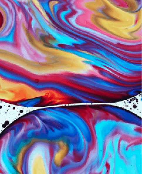
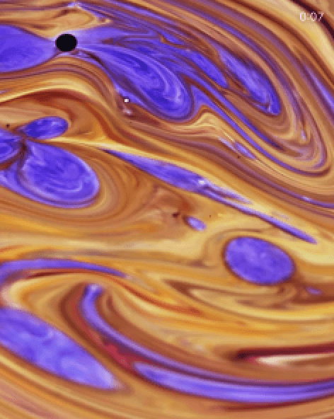
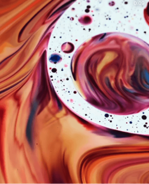
As a band we happened to meet this very special artist called Ruby Ingleheart (@ingleheartruby), who made these incredible oil paint projections. They created this ethereal mood that was precisely what I was looking for, to me this was the sky I was looking for. Sadly we didn't have the funds to commission them to create something for us specifically but it ended up being a huge source of inspiration.

As a band we happened to meet this very special artist called Ruby Ingleheart (@ingleheartruby), who made these incredible oil paint projections. They created this ethereal mood that was precisely what I was looking for, to me this was the sky I was looking for. Sadly we didn't have the funds to commission them to create something for us specifically but it ended up being a huge source of inspiration.

Ruby's photos of their own work

Visual exploration

It was time to start exploring how all of these ideas translated into our world and fit in with the single concept.

Challenge:

I briefed the band on all these ideas and they have mostly resonated, but they were struggling to see how they came together into our artwork. The concept was still too dispersed.

Since we were only distributing the single digitally I needed to design with digital streaming platforms in mind, which was not something I'd done before.

My approach:

I realised I needed to start visual exploration to get the abdn fully on board with my concept.


I looked into how a lot of my reference albums looked like on spotify and what worked well or not so well in the digital world. I knew it would help to start mocking up the visuals in situ as soon as the initial exploration was done.

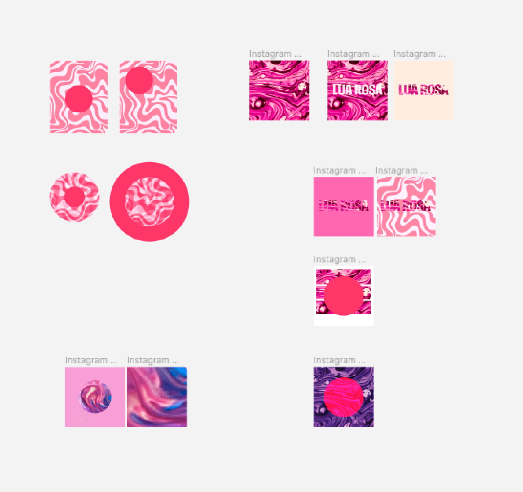
Figma screenshot of my initial digital brainstorm featuring Ruby's work

Refining some ideas and testing them out in situ

Constantly sense-checking ideas in situ on our Spotify profile

The two songs as a visual collection

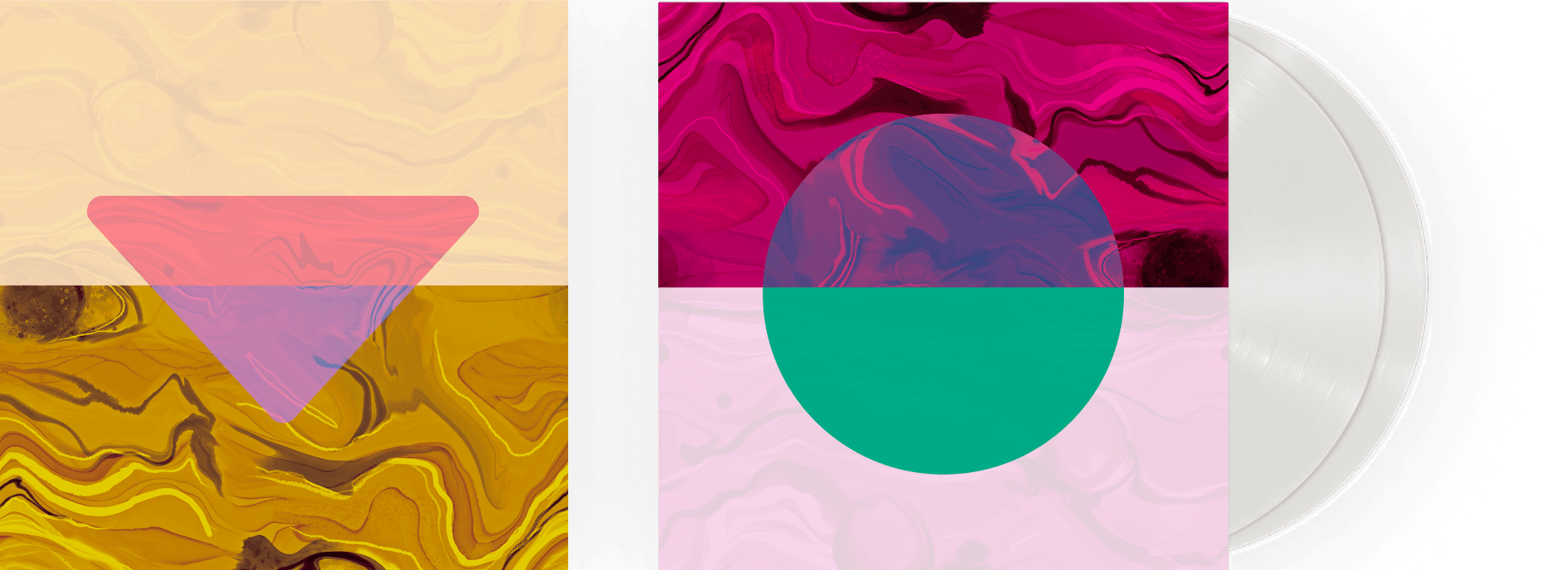
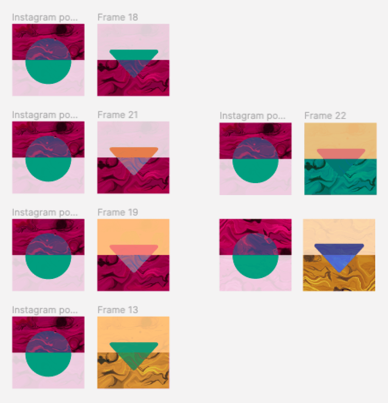
As I explored the different ideas I kept touching base with the band and they really got behind this idea of a really simple circle to represent the moon ("Lua Rosa" - the name of one of the tracks - translates as Pink Moon). So I knew I needed to make it work as a collection and a big part of that exercise was figuring out the use of color. I've decided on a triangle like shape for "Prova de Charme" playing with its double meaning (could mean both proof of charm but also charm's tasting) and pretending that charm is this magic liquid that one can taste in a sip. The triangle is like a cocktail glass for this charming tasting.

As I explored the different ideas I kept touching base with the band and they really got behind this idea of a really simple circle to represent the moon ("Lua Rosa" - the name of one of the tracks - translates as Pink Moon). So I knew I needed to make it work as a collection and a big part of that exercise was figuring out the use of color. I've decided on a triangle like shape for "Prova de Charme" playing with its double meaning (could mean both proof of charm but also charm's tasting) and pretending that charm is this magic liquid that one can taste in a sip. The triangle is like a cocktail glass for this charming tasting.

Exploring colour for the pair

The band's selection

In the end, the band picked this combo in these colors. The pink for "Lua Rosa"/Pink Moon (the green/blue came from trying to find the right contrasting color) and the gold to represent this imaginary luxurious charming drink, choosing the pink again for contrast but also to help connect the two as a collection.


From here, all that was left to do was to prepare the social media announcements for the release and to produce Merch that we offered as rewards to our crowdfunders.

Final artwork

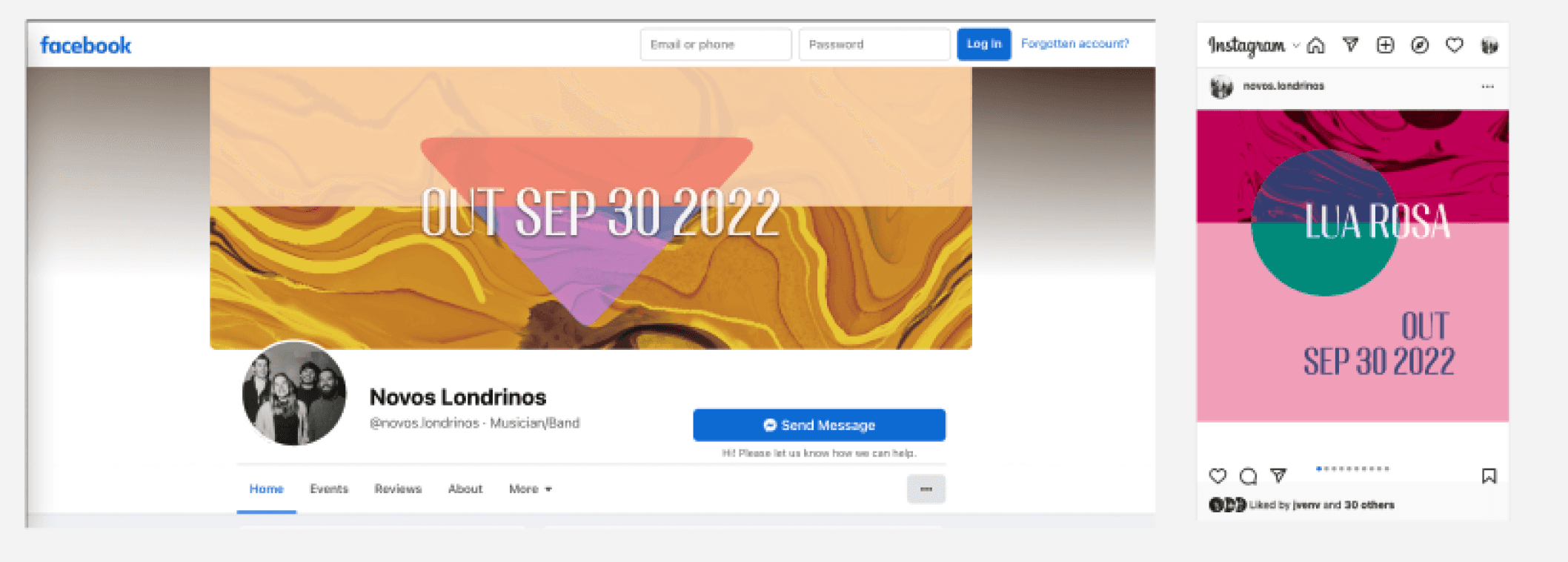
Facebook and instagram banners announcing the release

Instagram story designs

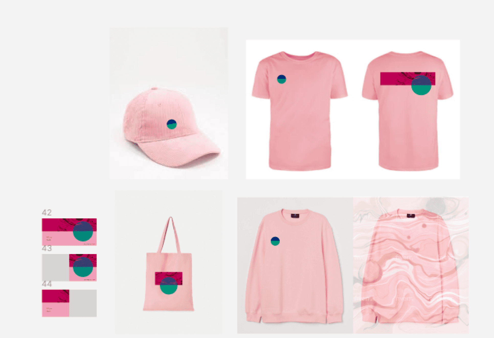
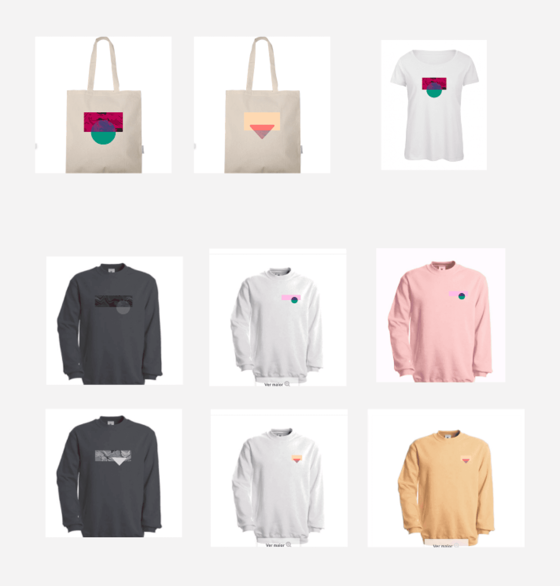
Initial merch brainstorm

Final merch collection
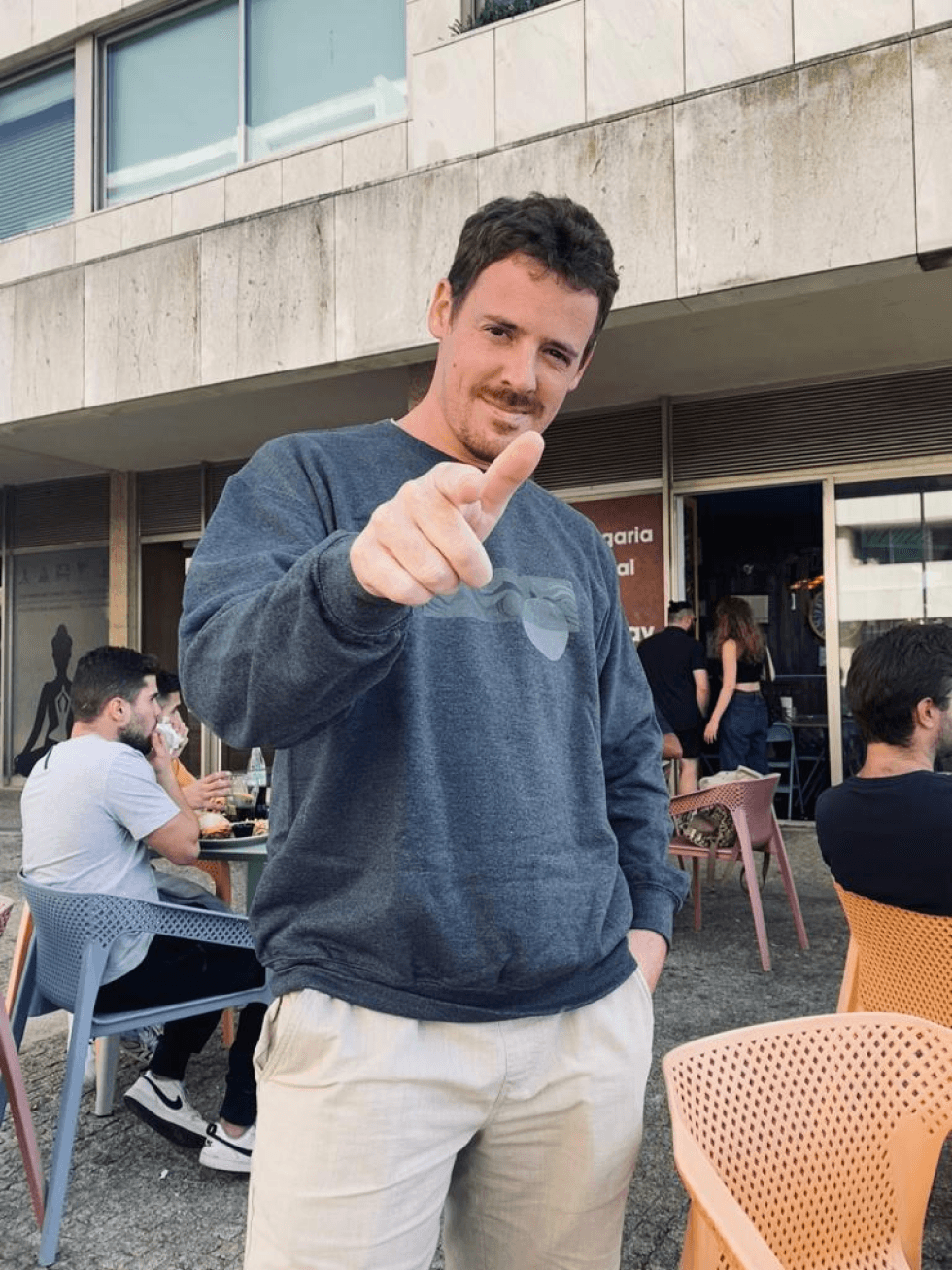
Our crowdfunders wearing their selected items of Merch
aspirant surfer ✦ passionate musician ✦ hopeless feminist ✦ social justice advocate ✦ psycology buff ✦ eternal student ✦ chronic overthinker ✦ zero waste proponent ✦ trainee coffee dialer ✦

Daydreaming in London, United Kingdom

aspirant surfer ✦ passionate musician ✦ hopeless feminist ✦ social justice advocate ✦ psycology buff ✦ eternal student ✦ chronic overthinker ✦ zero waste proponent ✦ trainee coffee dialer ✦

Daydreaming in London,
United Kingdom

aspirant surfer ✦ passionate musician ✦ hopeless feminist ✦ social justice advocate ✦ psycology buff ✦ eternal student ✦ chronic overthinker ✦ zero waste proponent ✦ trainee coffee dialer ✦

Daydreaming in London, United Kingdom

aspirant surfer ✦ passionate musician ✦ hopeless feminist ✦ social justice advocate ✦ psycology buff ✦ eternal student ✦ chronic overthinker ✦ zero waste proponent ✦ trainee coffee dialer ✦

Daydreaming in London, United Kingdom